You are not logged in.
- Topics: Active | Unanswered
Pages: 1
#1 2016-12-05 19:51
- tlmiller76
- Member
- From: AZ, USA
- Registered: 2016-11-29
- Posts: 498
More flattened menu
Is there any way to get the menu more flattened? Right now it's kinda annoying because almost EVERYTHING is under accessories.
AKA instead of:
Menu -> Applications -> Programs -> Accessories -> Internet ->
Menu -> Applications -> Programs -> Accessories -> Multimedia ->
Completely cut the Programs & Accessories out so that it was quicker & easier to get to apps, ie:
Start menu -> Applications -> Internet ->
Start menu -> Applications -> Multimedia ->
etc. etc. etc.
Q4OS Trinity machine - HP Probook 445 G11. AMD Ryzen 7 7735U, 16GB DDR5, 512GB m.2 NVMe SSD, Radeon RX780M, MediaTek MT7922 (AMD RX616) Wifi 6E + BT 5.2, 14" WUXGA 400-nit LCD.
Offline
#2 2016-12-05 20:32
- ichbin1199
- Member

- From: France
- Registered: 2016-02-09
- Posts: 34
Re: More flattened menu
Hi!
you should go to the welcome screen (if your welcome screen is not in your applications menu, you should type: sudo kwriteconfig --file '/usr/share/applications/q4os-welcome-screen.desktop' --group 'Desktop Entry' --key 'NoDisplay' 'false' in a terminal to make it appear). Then, choose the menu item, then choose your type of menu (bourbon, kickoff or classic) and on the righthand side, choose categories (instead of q4os) for the menu structure.
Samsung Q1 Ultra Premium umpc, (1.33ghz Intel core solo, 2gb ram)/Q4OS Scorpion/Trinity+Compaq CQ2301 (1.6ghzx2 Intel Atom 230, 1gb ram, used as a server)/Q4OS Orion/Trinity+Packard bell D2317 (2.2ghzx2 Intel Pentium, 2gb ram)/Q4OS Scorpion/Trinity
Offline
#3 2016-12-06 03:54
- tlmiller76
- Member
- From: AZ, USA
- Registered: 2016-11-29
- Posts: 498
Re: More flattened menu
Hi!
you should go to the welcome screen (if your welcome screen is not in your applications menu, you should type: sudo kwriteconfig --file '/usr/share/applications/q4os-welcome-screen.desktop' --group 'Desktop Entry' --key 'NoDisplay' 'false' in a terminal to make it appear). Then, choose the menu item, then choose your type of menu (bourbon, kickoff or classic) and on the righthand side, choose categories (instead of q4os) for the menu structure.
OH, that is soooooooooooooooooooooooooooooooooooo much better. That billion clicking for every program was so totally getting on my nerves!!
Q4OS Trinity machine - HP Probook 445 G11. AMD Ryzen 7 7735U, 16GB DDR5, 512GB m.2 NVMe SSD, Radeon RX780M, MediaTek MT7922 (AMD RX616) Wifi 6E + BT 5.2, 14" WUXGA 400-nit LCD.
Offline
#4 2016-12-06 11:13
- Dai_trying
- Member

- From: UK
- Registered: 2015-12-14
- Posts: 2,994
Re: More flattened menu
I found it quite annoying when I started using Q4OS, but I guess I have just grown accustomed to it now.
And an easier way to access the welcome screen might be to right click the desktop and select "Run Command" and then type welcome-screen.exu although it should show in the drop-down after typing a few characters.
Offline
#5 2016-12-06 11:34
- q4osteam
- Q4OS Team

- Registered: 2015-12-06
- Posts: 6,107
- Website
Re: More flattened menu
@tlmiller76
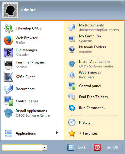
In addition, if you use 'Bourbon' or 'Kickoff' menu, we suggest you to add favorites shortcuts into the left panel of the Bourbon menu to be easily accessible, please see the picture attached.

It's also possible to customize the right panel of the Bourbon menu, see http://www.q4os.org/dqa011.html#desktop.4
Offline
#6 2016-12-06 14:36
- tlmiller76
- Member
- From: AZ, USA
- Registered: 2016-11-29
- Posts: 498
Re: More flattened menu
Oh, not sure if I'd need to customize the right side, good to know that it's possible. I've added the favorites on the left already, that I had done first thing.
Q4OS Trinity machine - HP Probook 445 G11. AMD Ryzen 7 7735U, 16GB DDR5, 512GB m.2 NVMe SSD, Radeon RX780M, MediaTek MT7922 (AMD RX616) Wifi 6E + BT 5.2, 14" WUXGA 400-nit LCD.
Offline
Pages: 1